Monday 30 March 2009

PPPPenguin


During a university trip to London on the 4th of March 2009 i visited senior designer/freelance artist Mark Cavanor of the Penguin Group. An ex-student of Stockport College Mark had originally up sticks from Manchester with the dreams and aspirations of becoming a film poster designer, but after repeatedly dieing of boredom and creative restrain he quit and turned swiftly to book publishing. 

The portfolio crit went well and we discussed in some length the work i presented before him. Mark gave well structured advice highlighting areas/points that i could improve upon and develop. I presented both my 2nd year body of work and projects that i am currently working on. Due to Mark working for the country's largest book publishing house my 'On The Road' sleeves we're an obvious focal point. The following advice was given;

*  Produce the books for real in dummy form.
*  Screen print illustrations/collages to enhance textural qualities.
*  Possible work to a grid.
*  Experiment in more depth the use and application of typography.

A current Berghaus opti-stud project generated plenty of discussion too. Mark gave the following advice;

*  Place sky scape's behind surreal banana mountain (long story).
*  Perhaps embossing footprints by hand rather than on the computer.
*  Real looking flag. With movement and shadow.
*  The fact that it is the new opti-stud (information/data etc).

We also discussed direction and which area of design i would like to work in i.e. book, advertising, film, graphics etc and possible building my portfolio with an aim in mind. 

I ain't got a clue? yet!

We exchanged email addresses and i intend to keep in touch. 

Saturday 28 March 2009

Wrap Up Warm


Just for laughs......

Play With Your Food


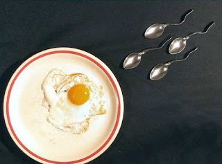
Above: are three images i stumbled across whilst on the 'inspire me, now' blog. Created, cooked, baked, etc, etc, etc my a number of agency's. Posted for the simple fact that i am currently working on a child obesity campaign. Juxtaposing food into new context is something of interest.

The Boys


No words can describe the instrumental?

Yes-Men And Women


Too many design students, not enough space in the inn? An unsettling and weighty statement hovering over every current bright eyed and bushy tailed graduate. That to a degree depends on our (students) definition and/or interpretation. We can either be disheartened about the fact that we may never get a job in the agency that every fucker brown noses or wise up and be provoked to knuckle down and work bloody hard to get where we aspire to be. "It's not where your going, it's where your at" (Ian Brown). Tom Shaughnessy of Glorious sums the matter (for me) rather well, "if your good enough, you'll get the job. Simple as". 

A staggering post published before Christmas on the online Independent denotes "brace to find another line of work" say practising fat cats to design students. The remark is on reflection somewhat justifiable. In light of the current economic downturn. On the 12 March 2009 Peter Saville at a Q&A on 'whats wrong with design education' denotes "there is too big a supply of young designers and far too many people creating mediocre work". A sentiment echoed throughout the professional field and a somewhat call to action to us, the students. I may be deluded or high on cellulose thinners? but for me it is not about money or the space. It is about the quality of the work and the amount of sheer graft we are willing to put in. Too many pot noddle students believe graphic design to be easy and a shore thing with a shiny red porsche waiting at the end of the rainbow. They're inevitable crackers, in it for the wrong reasons and living in fairy land. So 'is there enough passion in design?' i ask myself, perhaps, but probably not (my opinion). 

Whilst some firm realism in a diseased economy is without doubt appropriate, it appears a slightly tired and easy response. A recent Design Week article written by managing director Ian Cochrane of the Ticegroup suggests future graduates should go work in restaurants rather than aspiring to get jobs designing them. Avoiding designer as a profession if possible. Which is all well and good coming from seemingly well established practitioner, but rather of putting to one still studying. There is a feeling of egotism present, and not from Saville or Cochrane to which the argument (for me) has arisen; i mean the design profession as a whole. An inflexible pecking order between the established and the students. 

What to do next? is a question no one seems to have the answer to. Quit design and flip burgers, aim for an alternative field of the creative spectrum or soldier on? There are too many professional practitioners voicing the opinion that we should all just "pack up" because we are simple not good enough. According to recent figures/calculations published by the office for National Statistics, each sector of the current economy reported a dramatic fall of vacancies last quarter. Chartered Institute of Personnel chief economist Dr John Phipott denotes, "this looks to be a job recession favouring the over-50's" preceding the younger population.....Great.

The fact of the matter is, we as design students are embarking into an extremely competitive field, but if we are passionate about the arts we should love it for what it is and literally have to do it as a necessitate. Rather than the potential profit it could possible generate. Akin to a journalist or professional athlete, design is tough to surrender too, even when jumped-up practitioners paint a somber and bleak future. If such practitioners were advised to give up when they were students, would they be where they are now? I think not. 

The recession is tough for everyone, but design agencies should not be become shortsighted. Today's generation of creative graduates will someday be Britain's future creative directors (and Peter Saville's). If students were to give up, the industry would inevitably be caught in the headlights once the recession is over. Many students including myself have not yet felt the true force of the 'crunch' personally because of student loans, grants etc, but we some will.

"Designers are meant to be problem-solvers right? who help individuals get out of a pickle and everyone knows that this mighty credit crunch is one monster pickle".

Thursday 26 March 2009

You'll Never See A .....


What do farmers grow?


Dancing Mice


Absolutely cracking website (check it out very funny) and a vast amount of beautifully crafted books from Moire in Zurich. Some very interesting work designed for Balkankaravan below, including corporate typefaces and posters.


Teeth & Eye


Below are a strange and instantly eye-catching series of creature photographs by photographer Giacomo Brunelli from the book The Animals (why?).

Taken in his native Italy, Brunelli's images offer glimpses of familiar creatures but, they are invariably discerning and unsettling. I would like to know how on earth he made the animals look so pissed off - answers on a postcard.

Snapped on a 1968 Miranda Sensomat camera.


Turner Duckworth pt2


On the 5th of March 2009 i visited Jamie McCathie a designer of Turner Duckworth (London). I was originally scheduled to meet Jamie in the studio but, due to the fact the agency had just recently won a Grammy, work was hectic. So we arranged to meet in the pub next door which suited me down to the ground (good times). 

The portfolio viewing itself went well and i am appreciative of the feedback he gave me. I showed both my 2nd year portfolio and the work i was currently working on i.e Berghaus, Homebase packaging and my final Child Obesity campaign. Due to Turner Duckworth setting the D&AD brief and Jamie preliminarily working in packaging i was specifically looking forward to show him my 'mocked-up' seed packets. His response was positive and liked the concept/art direction but, because he is a judge he was unable to go into much more detail. 

My Child Obesity scamps produced good discussion too. Jamie's opinion on a subject such as obesity is that i should possible think about mixing humour with fact? creating outcomes that are not morbid but, informative. A memorable quote from the viewing was "a great idea can be something described in one sentence" a sentiment i now apply to all of my ideas.

Speed is the key within communication, to connect in a glance. 

We exchanged email addresses and i intend to keep in contact. I hope to mail Jamie some examples of my seed packets in the near future. 

See the Jamie from Turner Duckworth post i posted a few days ago.

Monday 23 March 2009

Sunday 22 March 2009

Hundred Mile High City


Throughout the past 7 months, a varied cluster of guest lecturers have spoken at Stockport College. From practitioner's working on their own, to individuals representing large and successful design agency's up a down the country. These agencies have included, ThoughtfulGlorious and Truth to name but a few. Two freelancers in particular stood out for me and although their styles are poles apart, the medium in which they both utilise is the same, ie: moving image. 

Tal Rosner, a self-taught film maker and graphic designer. Fuses his two artistic skills to fashion short moving, radical interpretations of musical compositions. Turning slow-paced video art on its head, to mold dynamic, ever-changing motion graphics. His work is personal and created more often than not for himself. However, on occasions he has been commissioned for title sequences including, Skins on Channel 4.
Ex-Stockport graduate Grant Gilbert on the other hand has created moving image identities for important (or important seeming) clients such as The Big Breakfast, The Word and The BBC under his studio, Double G. Although the similarity between the two isn't so different as preliminary believed. They do however differ greatly in the manner and way in which they both work to solve a clients brief. 

Aesthetic based Rosner on one hand often has the freedom of a blank canvas to make and create images/film for himself with no inflicting design corporations to answer. Although Gilbert still produces aesthetically beautiful pieces akin to Rosner, his are created on an  idea that he believes will communicate to a mass audience and comply to briefs set by powerful television institutions. 

Gilbert denotes, "a trailer is no good unless one knows what one is watching". 

Although Gilbert will generally create a logo, graphics and brand identity for an assigned client, frequently involving a bound brief with inflexible guidelines, Rosner inclines loose and adjustable ideals. His finished outcome will be pitched to the client subsequent to him explaining it to them with all creative aspects produced in house. Gilbert on the other hand will be given a film or indent to apply his formed graphics/logo within. Working much closer to the client throughout the design process often changing the design several times before the final outcome is reached. The liberty and creative control both designers encompass and the communication between themselves and the client differs immensely. I believe a high level of interaction between a client is an essential part of the design process.

While self-governing Rosner could repeatedly be seen as a fine artists (on occasions) with examples of his work possibly becoming gallery instillation's, Gilberts creativity will depend on the boundaries of a set brief. Rosner at times will also share such restrictions, but combines professional and personal work evenly and without animosity. Sometimes the client will know they require a change of design, but Rosner convinces corporations that they do. He likes to create for himself and aim to later generate profit from it. Rosners work is wide-ranging and his reputation is vast (individuals will specifically source him if he is what they desire). To a degree this is as well true of Gilbert, having successfully completed logos and identity for Smirnoff, More 4, C4.com and Channel 5, his class speaks for itself. Generally individuals will be familiar to the high standard he is capable of. This however, is no guarantee to him clinching a new contract as he still has to compete with other agency's.  

The process and techniques used by both are again similar, as the bulk are labelled under the umbrella term moving image. Nonetheless Gilbert trained as a Graphic Designer and gradually progressed towards a career in film and television. A by-product of a necessitate to be involved in an industry he believed the future. Our current green tendency as a civilisation is that if an example is printed on paper it will then become waste, if an example is generated on a computer screen it has the capacity to be re-used. Thus a seductive design enticement.

There is a clinical approach to Gilberts process that is visible. He is regimented and highly trained in his subject. He has the ability to solve inflicting problems because of the way in which he was taught (at Stockport College). Whereas Rosner appears loose and self-assertive possible due to the fact he is completely self-taught and holds his own processes and techniques close. During his lecture he mentioned that the preliminary software he began with he had  to experiment and learn until he was competent enough to solve questions, visually. "My work is often accidental" which is a matter of interest for me and an area that differentiates Rosner from Gilbert. Rosner does not create for profit or acclaim he does it to fight an unquenchable subliminal force/desire burning deep within his gut. PASSION. I feel what Rosner feels (perhaps) if my artistic side is not fat i will simple explode.

Although both designers are from the same field i have gained a lot of knowledge and an appreciation towards design because of them? A belief that if one sits comfortable for to long one will simple wilt and die.

Keep moving. Keep learning. Keep the PASSION burning.

xx

Friday 20 March 2009

Anti-War


Paul Rand, westing house, 1970 annual report cover

Tom Eckesley, Keep Britain Tidy


Simple yet elegant modern amalgamation of type and illustration. Less litter in a both a compositional sense and the idea it encapsulates.

Scrap Book Of Russian Book Jackets


Kuznetsov, E. Tsirk. (circus) Moscow, 1931


Sel'viaskii, Ii'ia C'vovich. Pushtong. Moscow, 1931


Bedney, Dem'ian. Schast'e Zemli. (happines of the earth) Moscow, 1930


Thursday 19 March 2009

Anton Stankowski

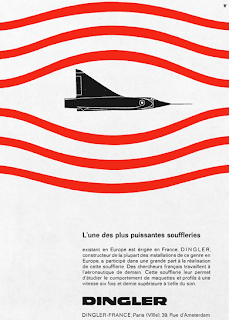
A design by Anton for 'Dingles' 1959, visually illustrating the movement of air this layout concerned measuring air relationship in a wind tunnel.

From visual presentation of visual processes.

Logo for the city of Berlin, 1969

Sunday 15 March 2009

No Direction

This collage/screenprint is a reaction to the new 'Doves' record Kingdom of Rust. (From my point of view) if the lyrics were ever to be visualised this would possibly be the result?

"An escaping loner with no direction"

Saturday 14 March 2009

A Psychedelic Monster

A preview of the deeply weird and wonderful 22-minute remix of Oasis' new single, Falling Down, by Amorphous Androgynous. This wild journey has got to be without a doubt the best remix....EVER.

I can't wait for main course. 
Long live the sound.


Oasis - Falling Down (a monstrous phychedelic bubble mix) 7 minute preview 

Wednesday 11 March 2009

What A Band

On the 'Culture Show' last night (Wednesday, 11 march) the band Fleet Foxes played and were later interviewed. I usually flick past the show because of the potentious bastard presenter (Kermode the frog), but the band caught my attention instantly. 

"An uncategorizable melodic sound with great harmony's"

Have a listen at there myspace page *******


Sunday 8 March 2009

Fingerpops Unmasked

Sky news have today unmasked the poetic duo 'The fingerpops'. In an attempt to rekindle there shit careers two members of the 80's factual drama 'the A-team' have had to hit the road masked and armed with lyrics. 

In interview regarding the exposed act Mr T simple commented "I'm a bird! I'm a plane! I'm a choo choo train". 


Mr T..........a.k.a Sergeant Bosco "B.A." Baracus


Dirk Benedict..........a.k.a Lieutenant Templeton "Face" Peck